Year: 2008
Size: A format paper back - 18mm x 111mm
Illustrator: Despotica
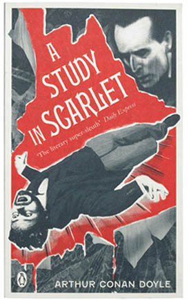
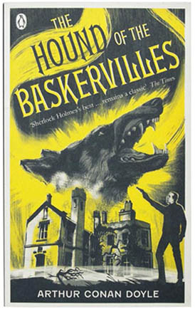
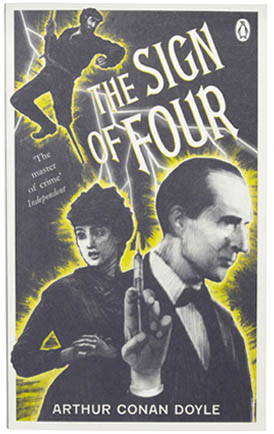
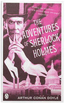
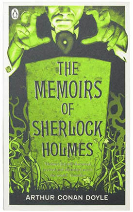
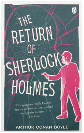
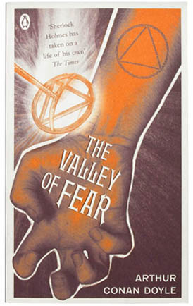
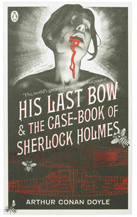
For the eight titles designer and illustrator ditched the cliched pipe and deerstalker silhouette and created a style that accentuates the sensational, adventurous side of the stories. Many people who have not had the pleasure of reading Conan Doyle’s original Holmes stories will have quite a developed and fixed set of ideas about the character, we wanted to confound those expectations and show that there’s more to Holmes than a collection of props. The vibrant, two-tone covers use typefaces that evoke the Victorian era, combined with an early cinema poster aesthetic that emphasises the adventure and excitement of the stories. We wanted to recapture the vigour of some of the original Strand Magazine illustrations and then amplify it using the compositional techniques of the film poster.

