


Observed in the Wish List
I am so happy, thanks to the Observer Magazine for taking time to feature our William Blake print in their wish list of prints. Its made my weekend plus I remembered the joys of reading the Sunday paper - bonus.

Jane Austen Print
Bickford smith & Johnson now have a home on the web. Click through to have a look.
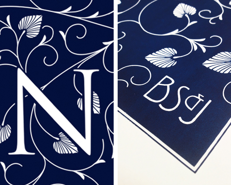
Plus our proofs are in for the next print. Available in dark blue ink and dark rose ink. I have taken a few snap shots so you can get a look at the print job. The pantone swatches might be more use for colour reference just incase anyone has a pantone book lying around. Dark rose: Pantone 694U and Dark blue: Pantone 540U.
Please have a look on our etsy shop: BSJ Prints


Malmo, Sweden
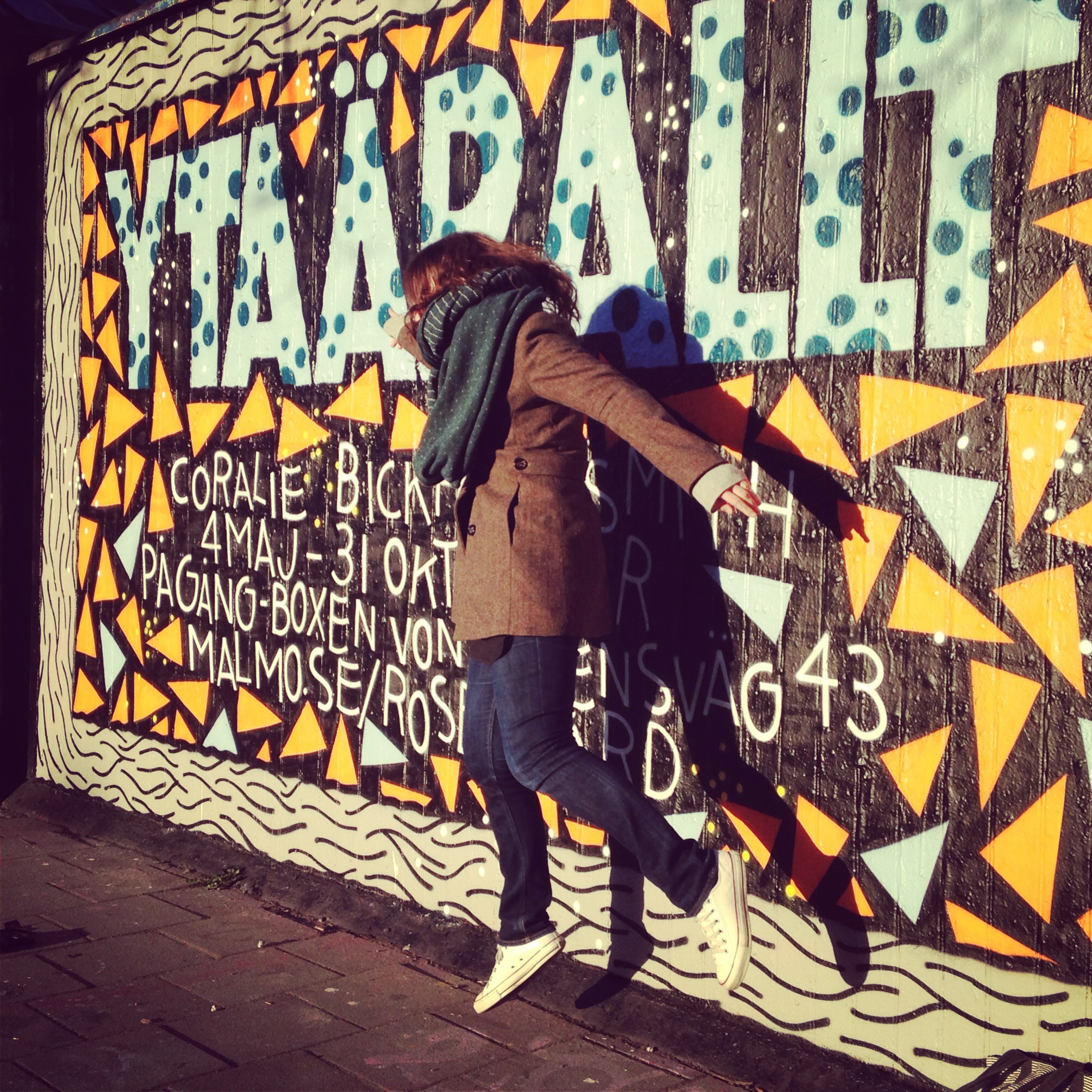
Photograph by Andreas Wilnerzon


Next Stop Sweden
Berlin
In Berlin I met some great people and visited some interesting bookshops. The super star Kristen Harrison from The Curved House was on hand to show us a local bookshop Shakespeare & Sons. It is run by two lovely people, Roman and Laurel, who bake fresh bagels and things and had a rather big supply of Penguin English Library titles. Its well worth a visit as you could while away hours sitting on the lovely chairs choosing which books to buy.
Then Matthias, who is an editor at Gestalten introduced us to Motto, a bookshop with all sorts of art books, limited editions and a very sweet cat that was dancing on top of all the books, I am unsure if this was allowed or if it was just breaking all the rules.
Obviously the Gestalten Space was a total book fest as well and the exhibition was a real treat as I got my hand on many books that I had only ever met on the internet. Plus they stock all sort of beautifully design goodies. Thanks so much to everyone at Gestalten for being so kind and giving me a brilliant opportunity, it was a real honour.

An evening with Me and Robert Klanten (Gestalten)
I am off to Berlin to meet the publishers Gestalten and speak along with Robert Klanten. Should be an interesting evening and I am excited to get to see all the books in the exhibition in the flesh, some of which I have only seen on blogs. So if it sounds like your cup of tea click the links to find out more.
This event will be held in English. Free entrance.
Book and Exhibition:
http://news.gestalten.com/new/all/25990
http://news.gestalten.com/event/fully-booked-ink-paper

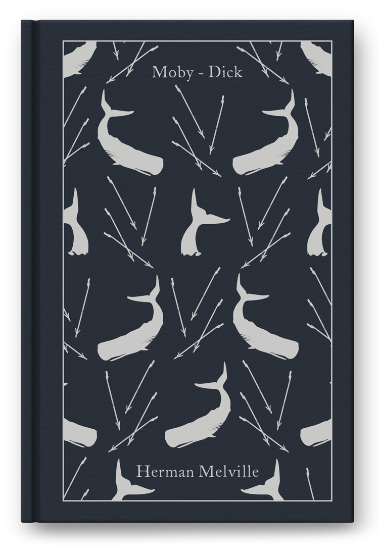
Moby Dick En Route

Jabberwocky & Friends
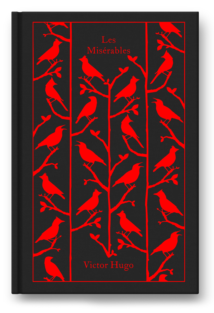
It has been such a busy year and I have not got around to getting quite a few cloth classics photographed. As temporary fix I will paste my mock ups here just incase anyone fancies a peek. Jabberwocky was illustrated by me. Vanity Fair was illustrated by Tom Johnson, it is adapted from the Penguin English Library version. The Count of Monte Cristo and Les Miserables were illustrated by Despotica.
Coming later on in the year are some new titles: Robinson Crusoe, Moby Dick, Anna Karenina, The Canterbury Tales, Frankenstien, The Adventures of Huck Finn and Far From the Madding Crowd.


Fully Booked: Ink on Paper
To coincide with the release of the book, Fully Booked: Ink on Paper, Gestalten are putting on an exhibition at Gestalten Space in Berlin. As I was invited to be included in the book I also got to enter some books into the exhibition alongside lots of great book designers. See the list of contributors below. It sounds like a treat for the bookish. Lots more information is available on their website. click here to have a look.
'Featured designers and design studios include: Bruketa & Zinic, Coralie Bickford-Smith, Daniel Eatock, David Pearson, Double Standards, Erik Kessels, Heimann und Schwantes, Herburg Weiland, Isaac Tobin, Isabelle Vaverka, Jim Tierney, Johanna Fuchs, John Gall, Joost Grootens, Jung & Wenig, L2M3, Leftloft, Made Thought, Nicholas Felton, onestar press, Peter Mendelsund, Prill Vieceli Cremers, Ritator, Sam Ita, Stefan Sagmeister, Studio Laucke Siebein, Three Star Books, Visual Editions, and Zumtobel.'

Foiled Again
Some amazing pieces in this new book published by Victionary. For a designer like myself who is into all things shiny it sure is a gathering of beautiful work. Creative review give it a nice review on their blog.


My Ideal Bookshelf
This was definitely a moment in my career. I was contacted by the supremely talented Jane Mount to take part in a book about books. Jane started the Ideal Bookshelf project in 2007. She paints portraits of people through the spines of their favourite books. Books that changed their lives, books that defined them and books that they read again and again. Jane teamed up with the writer Thessaly La Force to interview all the contributors about their selection. I obliged, the outcome was pretty amazing and unexpected, I ended up hanging out among the pages with a heroine of mine Patti Smith, probably the closest I will ever get to saying hi. It is strange to be in such high company and even though I feel like it was a bit of a coup, now I am there I am quite happy to quietly stay put. Check out the book here, and below the image of the cover is my shelf very lovingly painted by Jane.


Tiles Rock
My father was a great entrepreneur and was always creating fantastical objects to promote his latest project. Just before he passed away he asked me to produce a tile with his favourite piece of poetry as a gift for every member of the family. Needless to say he always had fantastical ideas about how I might promote my work, I always listened and nodded enthusiastically and never took action but before he passed I wanted to show him that I had finally listened. So while designing his tile I made my own tile and this was the result. It was such a joy to design as I am a mega fan of William De Morgan and his ceramic tiles. Like my dad I too have fantastical ideas, I keep meaning to design a series of tiles inspired by The Memorial to Heroic Self Sacrifice in Postman's Park in the City of London.

Letterpress
Last year I was asked by Curved House to produce a letterpress limited edition print that was presented to everyone that attended the launch of the Russian bookshop, at Waterstones, Piccadilly. I just remembered this piece of work because today I am working on not one but two books set in Russia.

Robinson Crusoe
I wrote my dissertation about the printed editions of Robinson Crusoe because Reading University have a collection that consists of over a hundred editions and retellings of Robinson Crusoe by Daniel Defoe, from 1747 to the present. The fact that by the end of the 19th century, no other book in the history of Western literature had more editions, spin-offs and translations meant that it was a great way to study how the process of printing and illustrating books changed with the changing tide of printing processes. The special collections librarian regularly found me asleep on my paperwork surrounded by editions. I might add that this was certainly not out of boredom but just that the number of hours I spent in that library was excessive. So needless to say that getting to design the clothbound version is a big deal to me. Here is a picture of what I have come up with. But beware it might change, as this is a very early sneak peak as the book is not due to be a book until November/December 2013.

Nice Ink
I love the intensity of the ink on these prints. I never got to show nice stuff like this with my old website so this is a step forward where I can share stuff that I get up to and get to work on. I visited the printers when I was in Lisbon and it was such a treat to get to see some beautiful work being produced.
The edition was printed at Centro Português de Serigrafia (CPS) in September 2011, it is made of 54 + 6 PA proofs in two colour versions (27 + 3 PA each) numbered and signed by me. This edition is a result of a partnership between Espaço BÁ and CPS in conjunction with the exhibition of my Penguin work in Lisbon.
![image[1].jpg](https://images.squarespace-cdn.com/content/v1/512ce51de4b03f1f54bec1d0/1362598212417-T1ZZT1QB136K1HHW0U8J/image%5B1%5D.jpg)
![image[2].jpg](https://images.squarespace-cdn.com/content/v1/512ce51de4b03f1f54bec1d0/1362598233795-PETXCXFA4CVPLY6YWCZV/image%5B2%5D.jpg)